Boggle is a word search game where you find words from a 4x4 letter grid that no other player has found in that round. This post talks about some of the interesting parts of building a Boggle solver website.
First of all, if you want to check out the Boggle solver site head over to boggle.falkus.co. If you’ve never heard of the game Boggle and you’re keen to read this post it might be worth scanning the Boggle wikipedia page first to understand more about the game.
I’ve been developing this site on and off for a few months now and on the whole have really enjoyed it. On reflection I think this is because it’s sufficiently different from the typical code I might work on in the day job. Plus its had a surprising range of challenges from UI elements to algorithms, making it well-rounded as projects go.
Visually Showing Letter Combinations
I’m starting with my favourite bit of the site, which is the graphics to show the combination of letters used to form a word. This is especially useful for longer words where it’s perhaps non-obvious how the computer has found an answer.
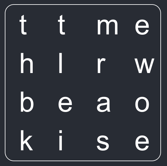
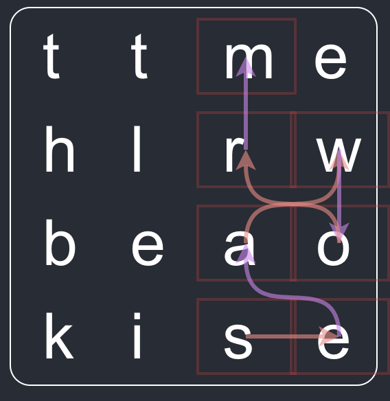
Take the following example board. There is a great seven letter word to be found, ‘seaworm’. Real user feedback on the first version of the site showed that it’s more engaging if we can show how the word is made:


To achieve the visuals I used react-xarrows. I tried some different style combinations and settled on semi-transparent pastel colours. I also alternated the colours and added arrows to try make the direction moving from letter to letter clear. I spent a good while just generating the graphs for loads of random boards. Partly because it’s fun to watch, partly to see if I’d got the word-finding algorithm wrong!
The slightly awkward part of this feature was reworking the site internals to go from an array of plain words to an array of objects which hold both the word and the ordered coordinates of each letter. Worth the effort though.
Words and Definitions
The solver needs to have a dictionary of English words. It’s currently using the list available here.
A solver website that tells you about the great words you missed feels incomplete if it cannot also give the definitions. A google for ‘Free JSON web dictionary’ led me to Free Dictionary API. Their API returns a detailed response with phonetics, meanings and synonyms. The solver site just picks the very first meaning and shows that. Nothing fancy going on here!
I find often words are in the solver’s dictionary that the API does not know about, which means no definition is shown. This is annoying, but I’m not quite sure how best to fix. I believe Google use the Oxford Dictionary (and Free Dictionary API is working from that), but I am not sure of a way to get the Oxford Dictionary word list in a suitable form. Get in touch if you have ideas on how to fix this.
Finding Words Quickly
My first pass at looking for words was brute force. Build up every combination of letters (within the allowable rules of the game, e.g. 3+ letters, consecutive squares, no repeats etc). Then look at the intersection of that list with the dictionary list. The first run of this unsurprisingly caused my browser to hang for a good few seconds. Two changes resolved the speed issues:
- Push the main word generation and search out to a Web Worker
- Build a trie of all possible words to quickly search as the possible word list is being built, instead of doing an expensive intersection operation at the end.
With both improvements in place the performance of the site feels fine. The very first run is a little slower because it’s building the trie structure in the browser. I used the mini trie lib available via npm.
I’d never used Web Workers before in a real project, so it was fun to actually put them to use. There are easy to use. If you’re interested in browser background processing have a read of the Mozilla docs, I think it was the only page I needed to get the feature done.
Inputting a Board
The first iteration of the site would give a random board to the user on page load. The user could also press a button to generate a new (also random) board. Whilst fine for development this is useless in the real world as the user needs a way to input their own board.
I had a very brief attempt at using character recognition from an image (via the Tesseract.js lib, as I thought a super cool way to input the board could be direct from a user’s mobile phone camera. Alas, this didn’t work, I expect because you cannot control the letter orientation which rather throws out typical OCR libs.
The more effective options that I did keep are:
- Changing each board letter to be a
selectelement - Allowing the URI path to be used as an input for all the letters (top left to bottom right of the board)
I rather like the URI approach. It also has the bonus of making a specific board’s letter combination shareable.
UI Tour
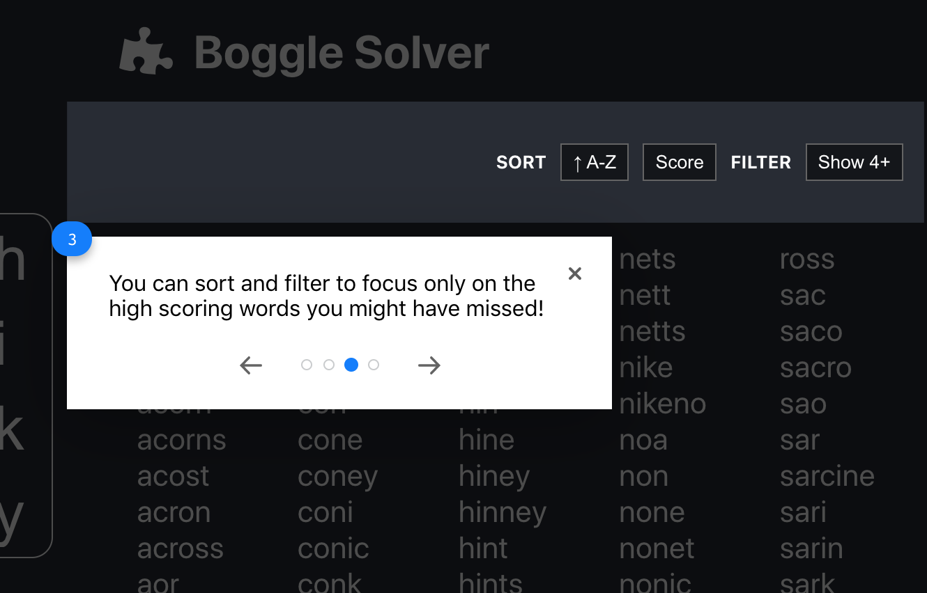
The URI approach feels like a developer feature, rather than something an end user would even know to take advantage of. To try and overcome this I installed Reactour on the site and set up some basic instructions, including an example of how the URI path works. I’d not used this particular plugin before but was impressed, it was quick to install and structure the steps. Plus it’s styled in an easy-going way, all in making the feature nothing more than a 5 minute job.

Pointing out the sort and filter options as part of the website tour...
CSS Shake
When playing Boggle one of the players shakes the game case to jumble up the letters. I had an idea to use the CSShake lib to do the same whist the board is loading on the solver website. This has sort of half-worked. I found on a slow connection the first page took so long to load that the shake visuals seemed pretty weird. On the other end of things, once the page has loaded the word search now happens so fast that the shake effect can’t even be seen.
I’ve kind of hacked around these issues by disabling on first load and by pausing very slightly if and only if the word search completes in under half a second.
Future Improvements
The site pretty much fulfills its initial aim to show words a player might miss in a game of Boggle. Some ideas in no particular order are:
- Make it mobile friendly
- Fix the dictionary list such that every word can have a definition shown.
- Show scores for words. The code already knows this, but I couldn’t quickly come up with a UI that I liked so I left it out.
- Adapt to allow the user to actually play a game of Boggle.
- Show a
textareafor the user to type in. - Start a timer.
- When the timer’s up, show the full word list with their score and the words they already found crossed out.
- Show a
- Add a ‘how to play Boggle’ tutorial.
Let me know if you reckon something else should be on this list.